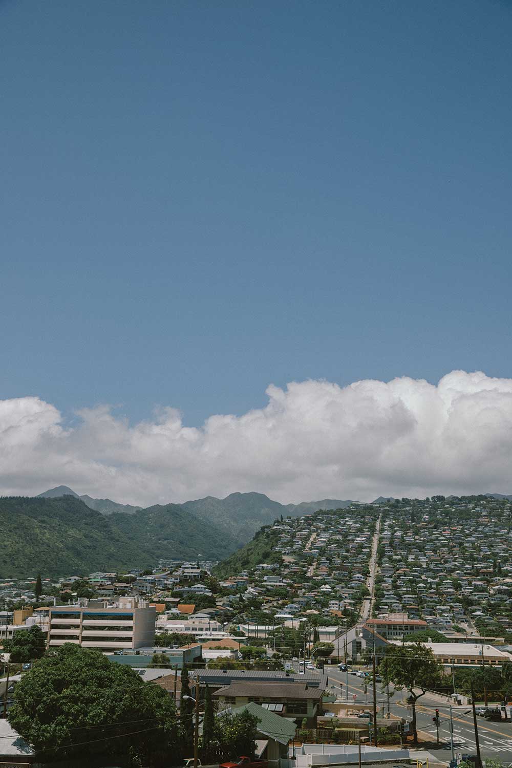
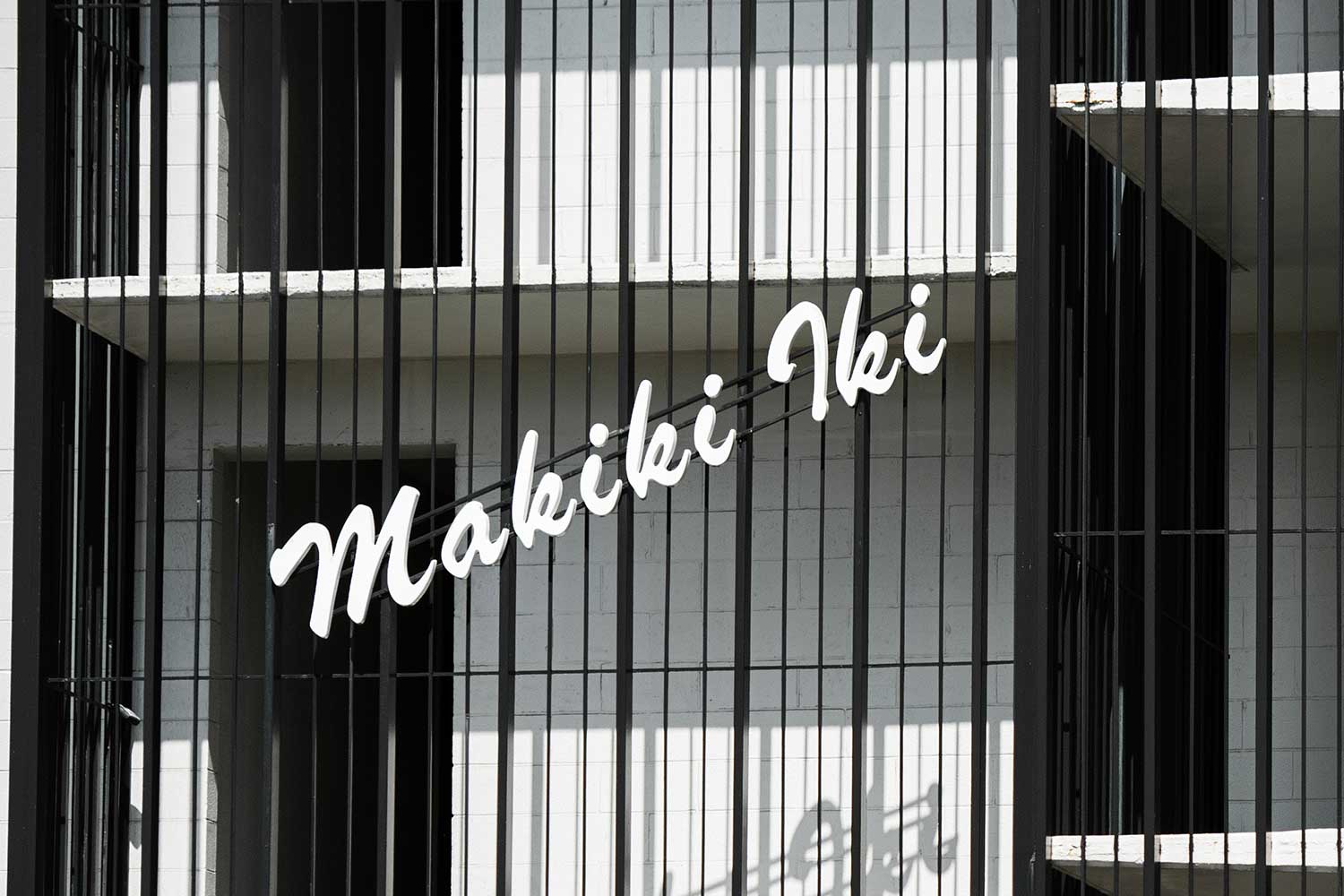
Just a mile inland of Waikīkī on a muggy Thursday, University of Hawai‘i at Mānoa professor and chair of graphic design, Chae Ho Lee, walks the urban neighborhood of Makiki looking for signs. A dense cluster of apartments and townhouses bisected by a freeway, Makiki has more in common with the working-class New York borough of Queens than the beachside bungalows seen on island advertisements. Home to nearly 100,000 locals, it’s the most dense district on the islands; President Barack Obama grew up in the neighborhood, as did pop superstar Bruno Mars. But what Makiki apartments lack in luxury, they make up for in vernacular signage—some of the most delightful in the world. They are the informal kind, made by ordinary local folks and passed by daily, ubiquitous yet worthy enough to be considered a form of public art.
For Lee, the signs reflect the islands’ early statehood era, when jets and visitors began arriving in droves. “In 1967, we reached one million tourists annually,” Lee says. “That’s when Hawai‘i became truly global and international. People settled here from faraway places, and they wanted the luxury they didn’t have back home.”
Most signs radiate a kitschy resort vibe, dangling from a facade that obscures a cookie-cutter walk-up apartment building. Their mid-century tropical designs and typography are endemic to the islands: oxidized copper, script that mimics handwriting, Hawaiian words translated in triangular blocks. These signs often reflect place, acknowledging an almost taxonomic Native Hawaiian language that had names for everywhere in the archipelago. Lee walks past residential buildings with motel names like The Breezeway, Tantalus Vista, Makiki Winds, Poinciana, and Kalii Koa—all bearing proud signs from decades past, as if the American dream passed out on mai tais and woke up in a sweltering neighborhood on the other side of the H-1 Freeway. At Heulu Gardens, Lee points out a handmade metal sign done in brush script; at Punahou Terrace he finds a rounded sans serif type reminiscent of the Dunkin’ Donuts logo. “This one looks like a personal project—not about utility, it’s nearly impossible to read from the street,” Lee says of the beige colored Princess Kealoha sign, its letters fluctuating between thin and thick strokes.
Across the street from Makiki Park—the scene of keiki soccer games and babies’ first luaus—the Hawaiian Holiday building takes the proverbial cake. The building literally looks like a cake. Prefabricated concrete letters and numbers in a pudgy font jut off a volcanic rock wall, above which is a three-story, sun-bleached bas relief of a fishing and hula scene reminiscent of a children’s ride at Disneyland. The work is inscribed with the name Hon Chew Hee, a local artist famous for his vast mural that once adorned the interisland terminal at the Honolulu International Airport.
“Most of these signs, we can’t figure out who made them,” says Matthew Tapia, a Hawai‘i-born graphic designer and letterer. With more than 48,000 followers on Instagram (@matthewtapia), Tapia has become internet-famous for documenting island signage under the hashtag “signsofhawaii.” The signs, Tapia says, are a tradition that went by the wayside when giant conglomerates took over. “People had pride in their buildings, put real craft into these things,” he says. “It’s so different from fonts on a computer that are sent to a digital cutter. I think we’ve lost the element of human hands.” Not in Makiki, though, where nostalgic labels are still maintained and still common, tributes to the good life greeting locals on their ways home.



Share: